Once a tennis parent, always a tennis parent.
We’ve enjoyed watching bits and pieces of the Australian Open Professional Tennis Tournament (1).
As ever, in 2019, watching the event via the ESPN+ app and/or Directv App is easy, particularly when complemented by tournament app updates and of course ongoing Twitter commentary.
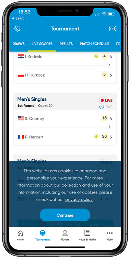
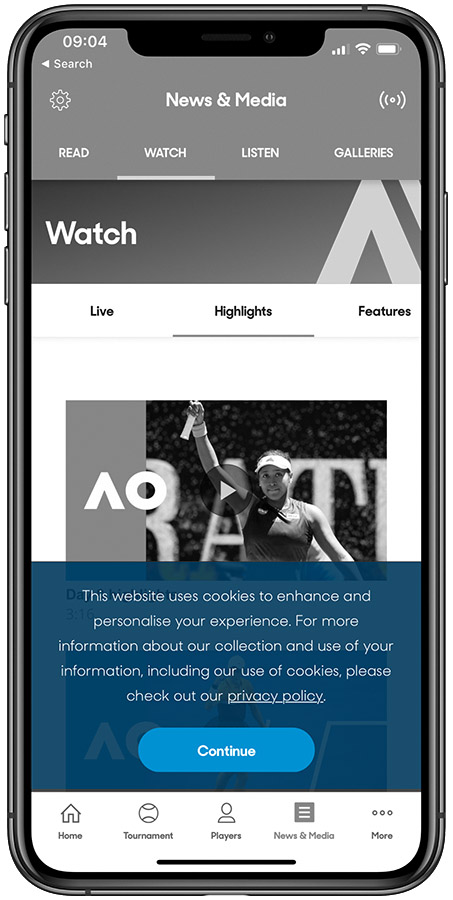
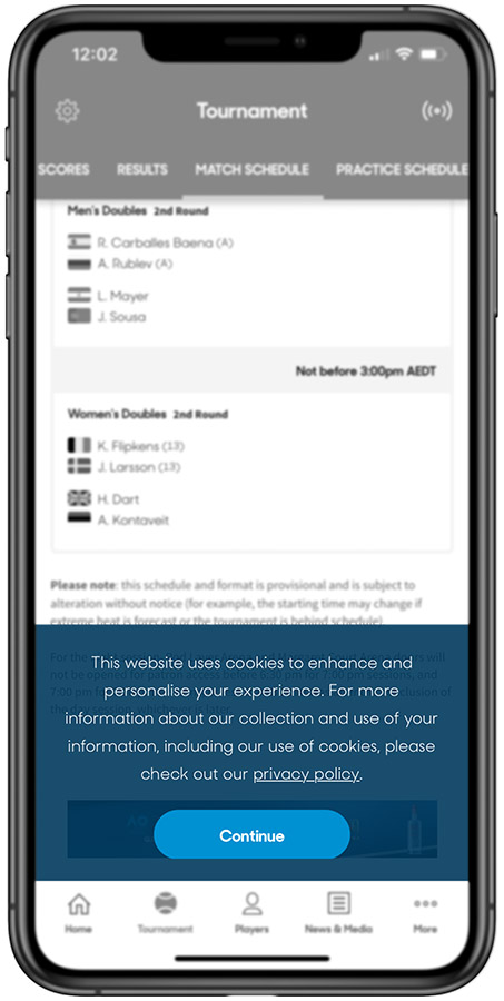
However, I have been greatly disappointed in the Australian Open’s App. They have essentially stuck their website inside an “app”, with all of the challenges that entails.
I am further amazed that this course was chosen given the budget and profile that the Open enjoys.
“This website uses cookies to enhance…”
One can draw a number of conclusions from this non-effort:
A. Elegance and a great user experience don’t matter.
B. Only a small percentage of users care; see “A”.
C. Website (cookie) data collection is so pervasive that we are willing to sacrifice an elegant experience for advertising and profiling (therefore monetary) reasons.
D. Top management is unaware.
E. Elegant and fast iOS app development is too expensive for this event.
F. The Open has sold digital experience rights to a 3rd party who monetizes in other ways and therefore does not value a great user experience.
G. ?
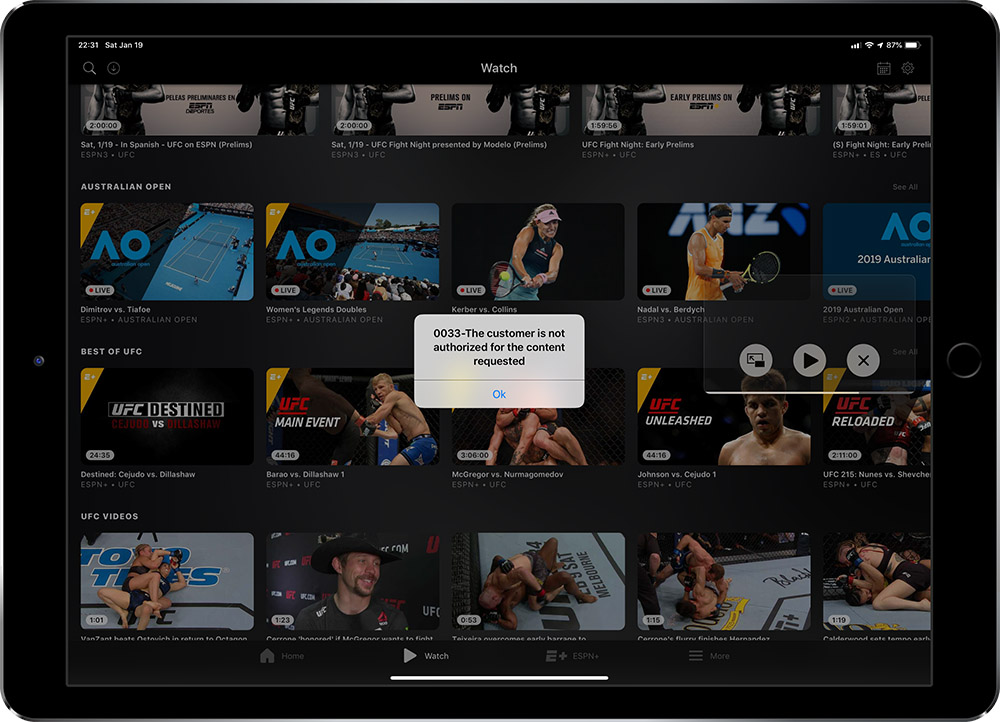
(1) Navigating the live video rights is a hassle. Some events are widely available in the United States, others difficult if not impossible to find. I tapped to view the Kerber vs Collins match and received this message:
We have tried to do better with amuz on iOS and Android (amuzapp.com). There are some bugs, but it is generally elegant, easy and fast.


